On 2 Sides – Balanced News and Perspectives

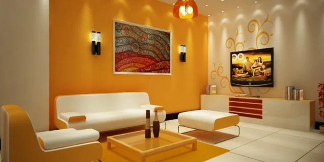
Color is rarely just an aesthetic preference. When you walk into a room, the pigments coating the walls, covering the furniture, and accenting the floors send immediate neurological signals to your brain. Long before you consciously register the furniture style or evaluate the layout, color has already shaped your heart rate, adjusted your blood pressure, and nudged your emotional state in a specific direction.
In interior design, color psychology serves as a foundational blueprint rather than a finishing touch. Every shade carries distinct wavelengths of reflected light that our retinas process, triggering hormonal and psychological reactions. By understanding how different hues, values, and saturation levels influence the human nervous system, you can design rooms that do not merely look beautiful, but actively support the specific activities and emotional mindsets intended for each space.
The Science of Spatial Emotion: Warm vs. Cool Spectrum
To use color strategically, you must first understand how the color wheel splits into two fundamental energetic halves: warm and cool.
-
Warm tones create connection and energy: Ranging from deep reds and spicy terracottas to golden yellows and peachy creams, warm colors visually advance toward the eye. This psychological trait makes expansive spaces feel more intimate, comfortable, and enclosed. Physically, warm tones stimulate appetite, elevate energy levels, and foster verbal interaction, making them natural selections for social gathering zones.
-
Cool tones expand space and invite stillness: Extending across the spectrum from soft sky blues and sage greens to moody violets and deep charcoals, cool colors visually recede. They trick the visual cortex into perceiving walls as farther away than they actually are, making tight rooms feel expansive and breezy. Cool wavelengths prompt the autonomic nervous system to downshift, lowering pulse rates and slowing respiration, which is why they dominate environments meant for rest and concentration.
Balancing these two families ensures that a house never feels overwhelmingly chaotic or uncomfortably sterile.
The Entryway: Designing an Immediate Sense of Arrival
The entryway or foyer sets the emotional baseline for your entire home. It acts as an airlock between the fast-paced, noisy outside world and the private, protected interior environment.
-
Welcoming warmth with muted earth tones: Soft clays, warm camels, and creamy linen shades signal safety, stability, and grounded comfort. They greet guests with open warmth without overwhelming their visual senses immediately at the threshold.
-
Deep drama with dark jewel tones: An emerging approach is painting a compact entryway in an unapologetic deep teal, forest green, or charcoal. Walking through a moody, enclosed foyer makes the adjacent living areas feel dramatically brighter, larger, and more open when you step into them.
-
Subtle accenting: Incorporate light wood species like white oak or natural woven grasses to soften bold entryway wall colors, preventing the initial threshold from feeling severe or unapproachable.
Your choice here dictates whether arriving home feels like a soothing exhale or an energetic burst of domestic life.
The Living Room: Balancing Social Energy and Grounded Comfort
Living rooms are multifaceted spaces. They must support boisterous weekend gatherings, lively family conversations, and quiet weeknight movie marathons. Achieving this duality requires colors that encourage connection without triggering sensory fatigue.
-
Grounded neutrals as the structural base: Avoid stark, clinical whites, which bounce artificial light harshly and create an unwelcoming atmosphere. Instead, favor warm stone, soft taupe, or oatmeal greiges with green or yellow undertones. These shades provide an enduring canvas that allows human faces and warm furnishings to take center stage.
-
Olive and moss greens for restorative calm: Green sits directly in the center of the visible color spectrum, requiring no ocular adjustment by the eye muscles. Bringing muted olive, eucalyptus, or moss into the living room fosters an organic, restorative balance that lowers ambient stress levels during family down-time.
-
Rust, ochre, and cognac accents: Introduce these earthy, desaturated warm tones through leather club chairs, velvet pillows, and textured wool rugs. These accents generate warmth and encourage engaging conversation without overpowering the quiet stability of your primary wall color.
By layering neutral bases with nature-inspired greens and warm textiles, you establish a space suited equally for entertainment and quiet decompression.
The Kitchen: Stimulating Vitality and Culinary Connection
As the industrious heart of the household, the kitchen thrives on energy, focus, and sensory appetite. The colors chosen here should encourage activity, appetite, and clean visual focus.
-
Crisp whites paired with warm woods: Clean whites, buttermilk tones, and pale biscuits create a backdrop that emphasizes cleanliness and lets the colors of fresh produce and cooked meals shine. Integrating warm butcher blocks or natural walnut cabinetry keeps the white envelope from reading as a clinical laboratory.
-
Appetite-stimulating yellows and warm terracottas: Yellow triggers the release of serotonin and promotes mental clarity. Buttercream walls or glazed terracotta backsplashes inject sunny, optimistic warmth that makes morning coffee routines feel cheerful and unhurried.
-
Crisp navy and slate for grounded utility: Deep blues on lower base cabinets anchor the kitchen, projecting cleanliness, order, and timeless durability. Blue balances the physical heat generated by ranges, ovens, and boiling cookware, keeping the room visually collected during meal preparation.
Avoid aggressive, high-saturation reds across large kitchen surfaces, as they can cause visual irritation and spike stress levels during frantic meal prep.
The Dining Room: Cultivating Appetite and Prolonged Conversation
Unlike the kitchen, where functionality and efficiency lead, the dining room is an intimate theater designed for lingering, storytelling, and sensory indulgence.
-
Deep reds, burgundies, and clarets: Historically favored in formal dining architecture, rich berry and wine tones stimulate the metabolism and enhance the flavor perception of savory foods. Under warm, low-level chandelier lighting, deep reds wrap the perimeter in rich shadow, making dinner parties feel intimate and exclusive.
-
Warm candlelight neutrals: If dark walls feel too dramatic for your home, opt for warm biscuit, soft parchment, or muted chamois. These tones reflect candle flame and low-kelvin fixture illumination beautifully, creating a gentle amber glow that flatters diverse skin tones and encourages guests to remain at the table long after dessert.
-
Moody jewel contrasts: Forest green and dark sapphire provide a sophisticated backdrop that makes metallic silverware, white porcelain plates, and glassware sparkle with clarity.
Avoid stark blues and minty greens on primary dining walls, as these cool wavelengths can inadvertently suppress appetite and make plated food appear unappealingly dull.
The Home Office: Promoting Focus, Clarity, and Mental Stamina
The modern workspace requires a delicate psychological tightrope: you need colors that stimulate cognitive endurance, analytical thinking, and mental focus without inducing agitation or restlessness.
-
Mid-tone sage and muted eucalyptus: Nature-based greens have been proven to enhance creative problem-solving and reduce eye strain during marathon computer sessions. A soft green office creates a peaceful environment where difficult tasks can be tackled without cognitive overload.
-
Dusty slate and cool blues for mental clarity: Blue is widely associated with logic, communication, and clear thinking. Desaturated blue-gray hues lower the pulse, quiet racing thoughts, and help you filter out ambient household distractions.
-
Bursts of citrus for strategic ideation: While an entirely yellow or orange office can trigger anxiety, small pops of mustard yellow or soft marigold on a pinboard, desk accessory, or framed art print supply the brain with bursts of playful, generative energy when brainstorming.
Keep away from pure, unpigmented stark white in home offices. Facing bare white walls under overhead lighting forces the eyes into constant micro-adjustments, accelerating afternoon mental fatigue and screen headaches.
The Master Bedroom: Inviting Deep Restoration and Surrender
The master bedroom has one non-negotiable primary purpose: facilitating restful, uninterrupted sleep. Every color applied in this space must signal the nervous system to let down its guard, halt stress responses, and prepare for restorative slumber.
-
Deep ocean blues and midnight navy: Darker blues visually mimic the onset of dusk and deep night. Painting bedroom walls in a rich, enveloping navy cues the brain that it is time to sleep, helping you unwind quickly at the end of the day.
-
Muted blush and dusty rose: Far from bubblegum pink, dusty terracotta-rose and soft cashmere blush carry gentle nurturing undertones. These shades feel warm, protective, and comforting without the aggressive visual stimulation associated with full-strength red.
-
Desaturated charcoal and shadowy pewter: Darker neutrals wrap around the bed like a cozy cocoon. When paired with crisp linen bedding and warm bedside lamp lighting, charcoal walls create a sleep sanctuary completely removed from daytime responsibilities.
Glossy sheens should never be used on bedroom walls. High-sheen paints reflect light erratically, while flat matte and velvet finishes absorb light, softening the edges of the room into calming shadows.
The Bathroom: Crafting Spa-Like Cleanliness and Renewal
Bathrooms are functional wash zones in the morning and private spas in the evening. The colors here must bridge hygiene with sensory retreat.
-
Seafoam, aquamarine, and mist: Water-associated tones naturally evoke cleanliness, freshness, and renewal. Pale blue-greens bounce morning light cleanly, making early grooming routines feel refreshing and invigorating.
-
Warm travertine and sand: Earthy beige, warm stone, and unbleached muslin tones recreate the organic atmosphere of modern luxury bathhouses. These warm minerals neutralize the cold, hard expanses of porcelain, glass, and polished chrome fixtures.
-
Charcoal and slate for modern contrast: Using deep slate tiles or moody paint in a powder room creates an intimate jewel-box impression that feels luxurious and intentional.
Always consider how bathroom wall paint reflects on your complexion. Avoid murky yellows or neon greens around bathroom mirrors, as they bounce unflattering color casts onto your skin, making morning self-checks discouraging.
Frequently Asked Questions
How does natural window orientation alter the way wall colors read in a room?
Natural sunlight changes color temperature based on compass direction. North-facing rooms receive cool, blue-tinted indirect light that can make cool grays and crisp whites appear cold and dingy; these spaces benefit from warmer undertones like peach, creamy ivory, and warm greige. South-facing rooms enjoy intense, warm amber light all day, which flatters almost any hue but can wash out delicate pales and intensify hot yellows. East-facing rooms read warm and bright at dawn before turning cooler by afternoon, whereas west-facing rooms start out quiet and turn blazing orange-red as the sun approaches the horizon.
What is the difference between hue, saturation, and value in interior design?
Hue is the pure name of the color family itself, such as red, blue, or yellow. Saturation describes the intensity, purity, or chroma of that color; a high-saturation green looks like neon lime, while a low-saturation green is softened with gray to become soothing sage. Value refers to the lightness or darkness of a hue, determined by how much white or black is blended into it. In color psychology, saturation often dictates emotional intensity more than hue; low-saturation colors soothe, while highly saturated colors excite.
Can using too much of one calming color make a room feel depressing?
Yes, excessive immersion in monochromatic cool tones, particularly flat cool grays and lifeless icy blues, can inadvertently foster feelings of lethargy, isolation, and emotional coldness. If the nervous system receives no contrasting visual stimulation, the space can feel dreary rather than serene. Always introduce textural variety, warm timber accents, unlacquered metals, or complementary warm textiles to prevent serene palettes from turning melancholy.
How do dark, moody paint colors impact spatial perception in tiny powder rooms?
While popular interior advice suggests using pale shades to make small spaces appear larger, applying dark, saturated hues in tiny powder rooms accomplishes an equally effective optical trick. Deep charcoals, ink blues, and hunter greens blur the physical corners and boundaries of the room, making it difficult for the eye to pinpoint where one wall ends and the next begins. This creates a sense of infinite, velvety depth that turns an awkward small footprint into a cozy, luxurious jewel-box space.
Why does white paint sometimes look clinical or institutional in residential spaces?
Pure, un-tinted white paint contains no secondary pigments to absorb or soften light wavelengths. When exposed to harsh direct sun or cool artificial illumination, pure white bounces all light frequencies back into the room simultaneously. This high reflectance can trigger subtle eye fatigue, wash out facial features, and create a harsh, institutional feel. Using off-whites containing minute drops of red, yellow, or umber pigment softens this harsh glare, imparting architectural warmth and gentle depth.
How should I select cohesive trim and ceiling colors when painting walls in rich, moody tones?
To achieve an enveloping, seamless atmosphere, consider color-drenching the room by painting the walls, baseboards, door frames, and ceiling in the identical hue. For this approach, vary the sheens: use flat or matte on the ceiling and walls to absorb light, and durable satin or semi-gloss on the trim to resist scuffs. If you prefer contrasting trim, avoid stark pure white, which creates a jarring, choppy boundary. Instead, select a complex, warm off-white that shares the same subtle undertone as your main wall paint.